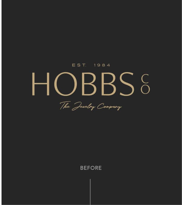
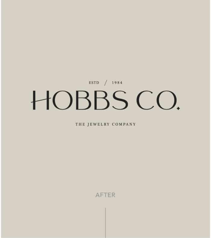
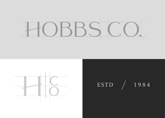
Branding

Hobbs Co. is a father-daughter owned jewelry store founded in 1984 that specializes in fine, custom, and estate jewelry.

Situation

Hobbs Co. approached us to help revamp the brand after the company had gone through some growth initiatives and were looking for help to guide the brand in a new direction. One of the owners, Stratton Hobbs, requested that revamped logo be classic, yet unique to them and their new brand. It was important for the brand to reflect their importance to quality, but was not too high end.

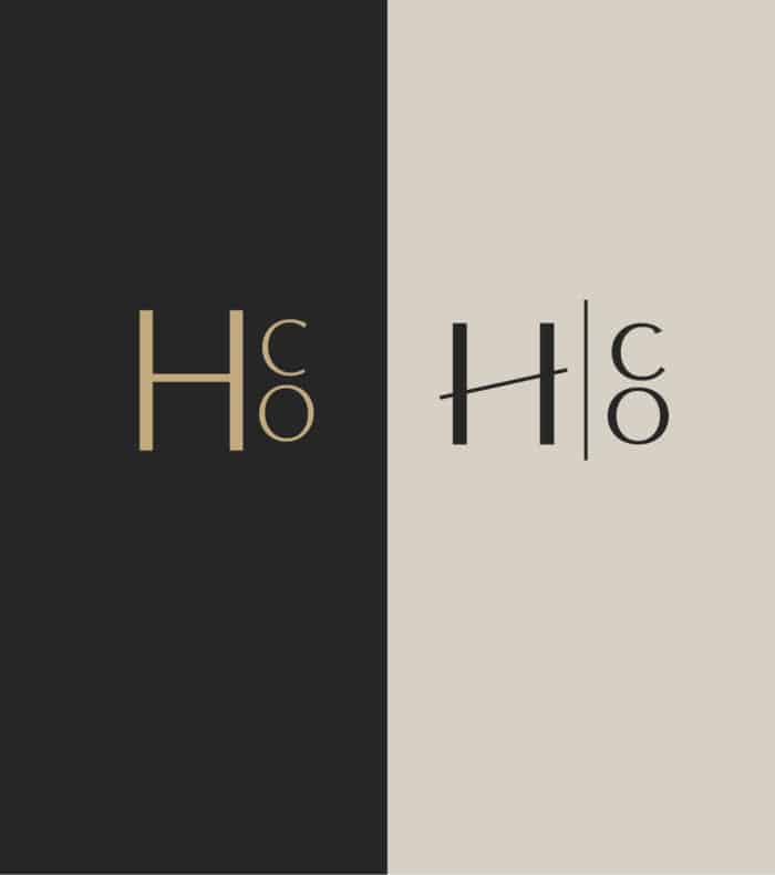
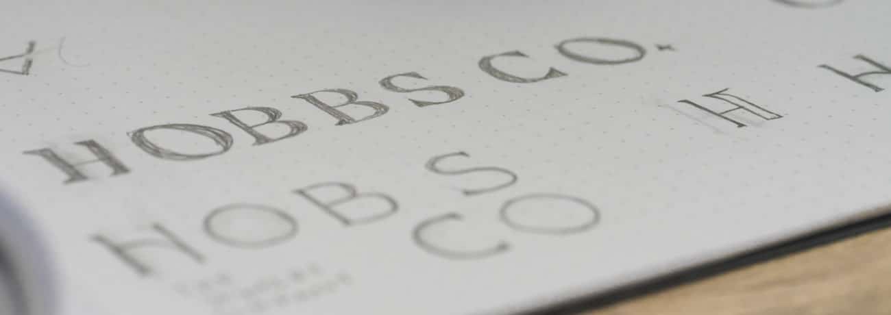
The current logo, although adequate, didn’t have the modern shine they wanted to present. We were tasked with creating a brand that is evergreen, standing the test of time.

The Strategy

We began the strategy for this brand’s revamp by building a custom designed typeface and elevating the modern lines of the previous logo. Though the cursive elements of the previous logo gave a whimsical touch to the brand, we replaced it with a more classic serif. We then replaced the previous gold color for a grey and beige neutral for the modern touch we were focusing on. Though we were rebranding, it was important for us to keep the H with the CO stacked as a nod to the original design to keep some of their history present.

Tailored To Perfection

During our time working the rebrand for Hobbs Co., we created multiple variations until we tailored it to the perfect fit for their company. We wanted to create a timeless logo with a twist, including a small diamond at the end of the logo to tie it back to the Hobbs Co. jewelry company, and a slant to the H in place as the differentiation to show an edgy touch.

We believe when modern elements meet timeless elegance, magic happens.